One Hole Page, Two Jobs — and They’re Not the Same Job
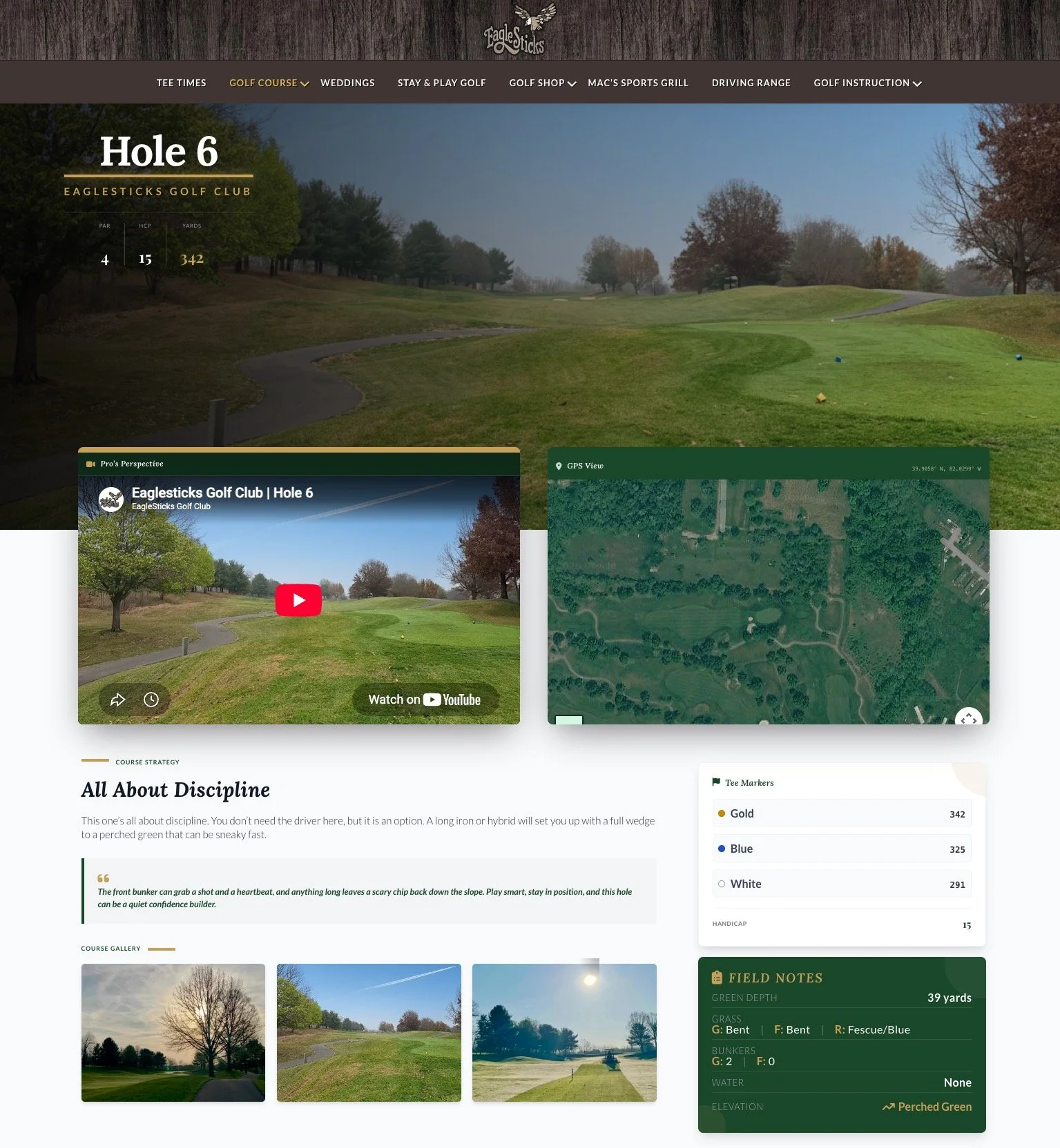
Almost every golf course website has some version of a “Hole 6” page. Ours does too. It’s got a pro’s-perspective video, a satellite GPS view, a photo gallery, a scorecard-style stat line, and an FAQ. It works on desktop and mobile, it’s built to be found in search, and its job is simple: give someone a reason to book a tee time at your course instead of the one down the road.
That page is doing exactly what it should be doing. The mistake is assuming it’s also useful once that same golfer is standing on the actual tee box, thirty seconds before their tee shot.
The moment nobody designs for
Course websites are almost entirely built around one moment: the decision to book. Everything upstream of that — the homepage, the course tour, the hole-by-hole pages, the reviews — is optimized to get a golfer from “curious” to “confirmed.” That’s the right instinct. It’s also only half the golfer’s actual experience.
The moment after check-in is different in almost every way that matters:
Different device posture. At home, a golfer is on a couch with two hands and no time pressure. On the course, they’ve got a phone in one hand, a club or a cart wheel in the other, and a group waiting behind them.
Different question. Before booking, the question is “should I play here?” On the tee, the question is “what do I hit, and why?”
Different tolerance for friction. A golfer researching a course will happily watch a 90-second video and scroll a gallery. A golfer on the tee box will not load a satellite map embed. They’ll just guess, or ask a playing partner, or skip the question entirely.
Most courses only build for the first moment. The second one — the one that actually happens 18 times over four hours — is left to whatever’s rattling around in the golfer’s head, or whoever happens to be standing nearby.
Why one page can’t do both jobs
The instinct, when a course realizes this gap exists, is usually to just add more to the existing hole page — more tips, more detail, maybe a mobile-friendly tweak. That’s the wrong fix, because the two jobs actively pull against each other.
A marketing page wants to slow a visitor down: watch this video, look at this gallery, read this description, feel something about the course. An on-course tool wants the opposite: get the golfer an answer in the time it takes to glance at their phone and put it back in their pocket. Optimizing for one makes you worse at the other. A page fast enough to be useful on the tee box is too thin to sell the hole to someone researching the course from home. A page rich enough to sell the hole is too slow to be useful mid-round.
The fix isn’t a better hybrid page. It’s two pages, built for two different moments, that don’t pretend to be each other.
What an on-course page actually needs to do
Once you accept that the on-course moment deserves its own tool, the requirements are narrow and specific — closer to a caddie’s job description than a marketing brief:
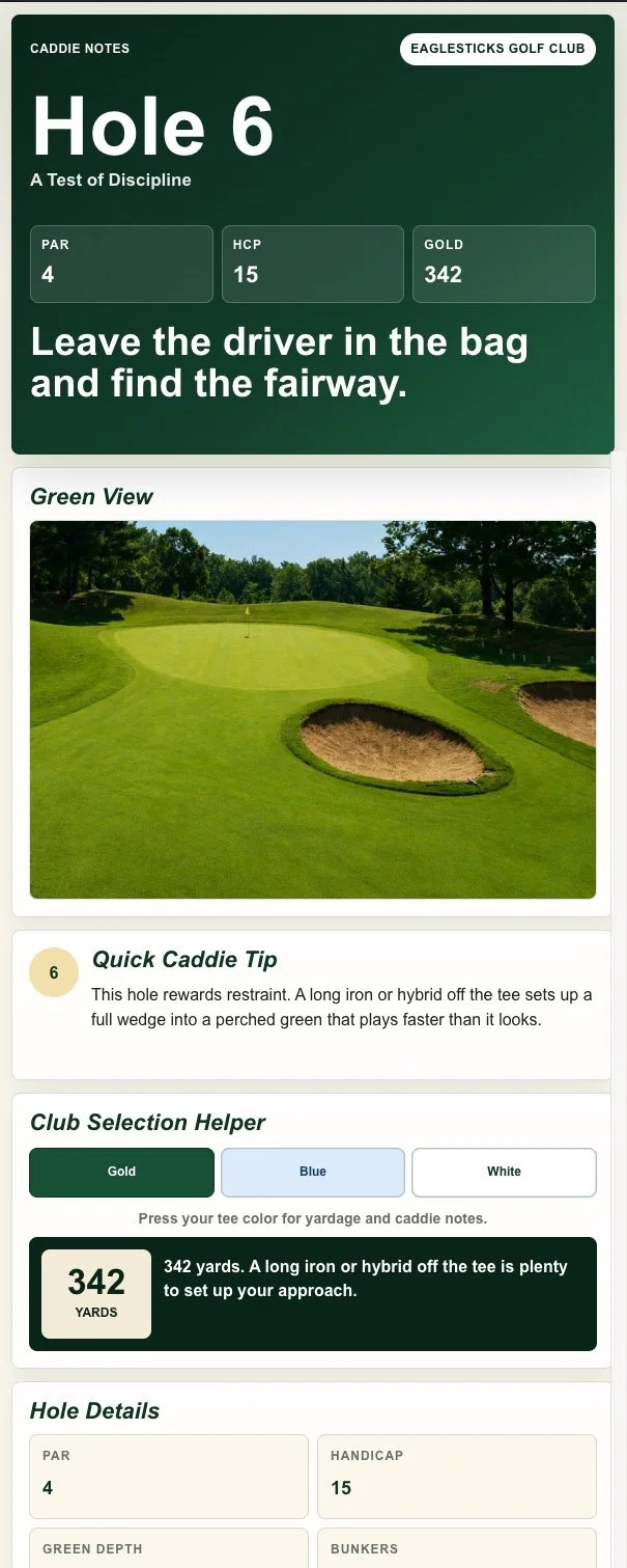
Answer for the tee the golfer is actually playing. A generic yardage is close to useless. A player on the forward tees and a player on the tips are playing different holes, with different strategies. If the content doesn’t change based on which tee a golfer selects, it isn’t really answering their question — it’s making them do the math themselves.
Give an opinion, not just a number. “342 yards” is data. “Leave the driver in the bag and find the fairway” is a decision already made for the golfer. A good caddie doesn’t hand you a spec sheet and walk away — they tell you what to do and why. On-course content should do the same.
Talk about the miss, not just the ideal shot. Every hole has a version where things go right and a version where they don’t. Golfers mostly need help with the second one: where the trouble actually is, what a bad shot turns into, and how to recover from it without turning one mistake into three. A page that only describes the perfect shot isn’t helping the golfer who’s actually in trouble.
Load fast, on a phone, without asking much of the golfer. No video to buffer, no map tile to load, no scrolling past content built for a different purpose. The bar for on-course content is: can a golfer get their answer before their group starts asking where they went.
Two pages, doing their own jobs
None of this replaces the marketing hole page — it just means that page shouldn’t be asked to also work on the tee box. The marketing page keeps doing what it does well: selling the course to someone deciding whether to book. A second, mobile-first page picks up the moment the marketing page was never built for: the eighteen small decisions a golfer actually has to make once they’re already there.
Course websites have spent years getting good at the moment before the round. The next gap to close is the round itself.